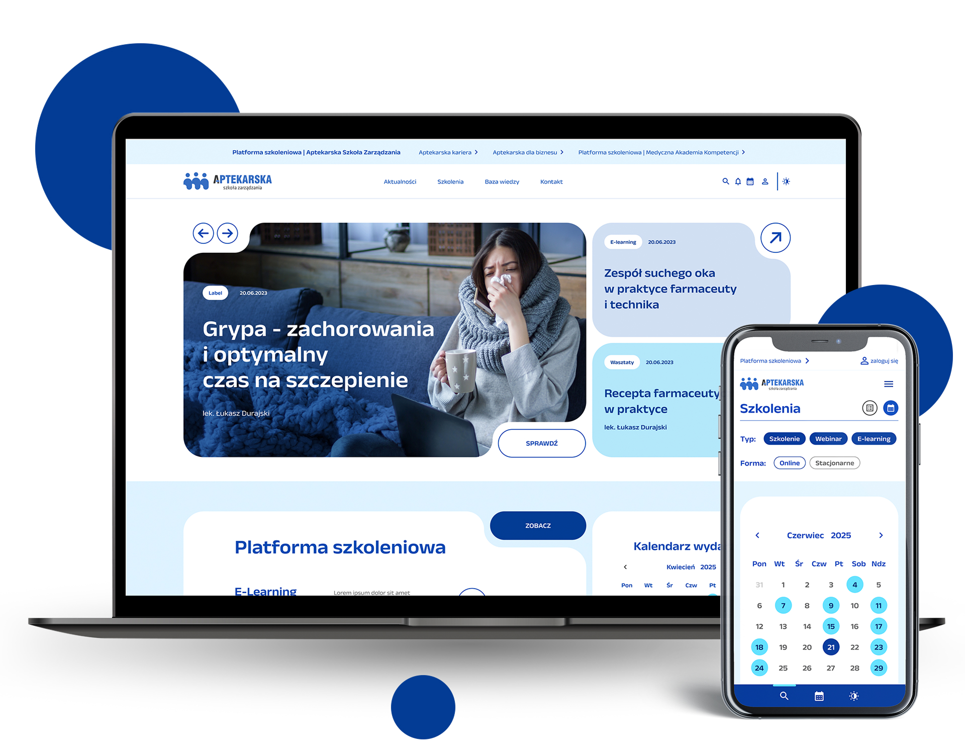


The redesign of the website layout led to a broader update across all brand layouts. I designed a new website structure for a client offering training programs for medical professionals, aiming to create a fresh and intuitive experience that makes it easy to browse and select courses, while remaining visually consistent with the existing brand logo.
The layout is based on a modular tile system, with shapes inspired by the human figure featured in the logo. The platform was built on a unified design system, where individual themes differ in color – while the primary color remains a deep navy (associated with education), accent and secondary colors vary across different medical professions.
The new visual direction was adapted depending on the context – more structured and restrained for educational materials, more dynamic for events, and more playful for social media content.
Role
Designer
Tools
Adobe Suite, Figma